Choosing the right type of graph to represent your data
Before you decide on what type of graph you need you first need to understand a little about the type of data that you have collected while doing your SBA. CXC does expect that you will choose graphs that you have used throughout the curriculum especially while doing the statistics unit.
Numerical Data can be broadly classified in one of two groups.
Continuous data on the other hand is data that has to be measured. This type of data can take any type of value including fractional values. Examples of continuous data are time, length, mass, volume etc
Numerical Data can be broadly classified in one of two groups.
- Discrete data
- Continuous data.
Continuous data on the other hand is data that has to be measured. This type of data can take any type of value including fractional values. Examples of continuous data are time, length, mass, volume etc
Types of graphs that you may use in your SBA to represent discrete data
Line graph
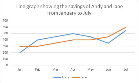
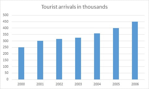
Line graphs are used to track changes in data over a period of time. Line graphs can also be used to compare changes over the same period of time for more than one group. Line graphs are good for showing the periods of greatest or least change over other periods. Examples could be used to show the number of tourists arriving at a destination over 5 years, the cost of an item over a period of time the changes in the price would be tracked, the growth of a plant over a period of time or the changes in a budget over time
Line graphs are used to track changes in data over a period of time. Line graphs can also be used to compare changes over the same period of time for more than one group. Line graphs are good for showing the periods of greatest or least change over other periods. Examples could be used to show the number of tourists arriving at a destination over 5 years, the cost of an item over a period of time the changes in the price would be tracked, the growth of a plant over a period of time or the changes in a budget over time
Bar Graph
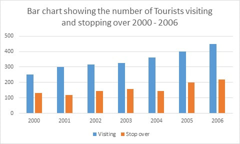
Bar graphs are used to compare things between different groups or to track changes over time. The same information that’s placed on a line graph can be placed on a bar graph. However, when trying to measure change over time, bar graphs are best when the changes are larger.
Bar graphs are used to compare things between different groups or to track changes over time. The same information that’s placed on a line graph can be placed on a bar graph. However, when trying to measure change over time, bar graphs are best when the changes are larger.
Pie Chart
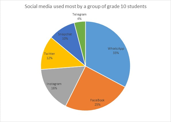
Pie charts are best to use when you are trying to compare parts of a whole. They do not show changes over time.
Pie charts are best to use when you are trying to compare parts of a whole. They do not show changes over time.
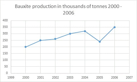
When graphing distributions containing continuous data such as on the table below the options in Microsoft Excel which most people use become limited. You can put this information in a bar graph as follows
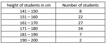
|
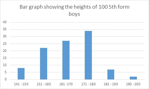
|
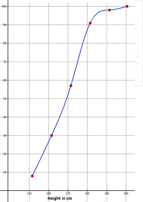
However it is best to represent the information as a histogram. This kind of data can also be used to draw a cumulative frequency curve or frequency polygon. A sample cumulative frequency curve is shown below
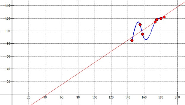
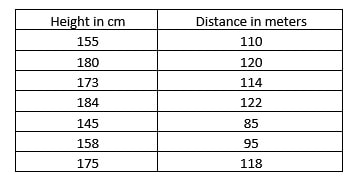
If you are trying to find a relationship between two quantities such as in the table below which shows the heights of students and the distance they can throw a cricket ball then a scatter plot is useful.
|
|
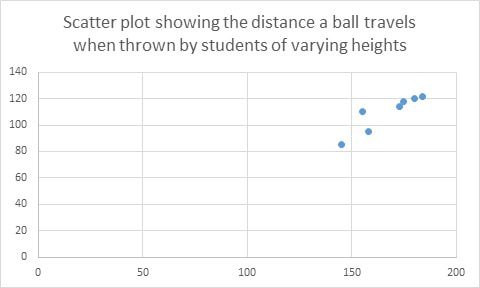
This information is better plotted in software such as graph [you can find the graph software here <https://www.padowan.dk>]that can do the scatter and put a best fit line through it thus giving a better interpretation of the relationship. This is seen below